Visualization
EPM outputs are standard CSV files and a GDX binary — you can load them into any tool you prefer. Three ready-made options are available if you don't want to start from scratch.
Options at a glance
| Option | Best for | Requires |
|---|---|---|
| EPM Dashboard | Quick interactive exploration, non-technical users | Web browser |
| Python | Custom analysis, scripting, reproducible figures | Python + Jupyter |
| Tableau | Polished stakeholder dashboards, scenario comparison | Tableau Creator license |
EPM Dashboard
The built-in web dashboard lets you explore results interactively — without writing any code. It can also be used to launch model runs and configure scenarios directly (see How EPM Works).
The dashboard reads the CSV outputs from output_csv/ automatically once a run completes.
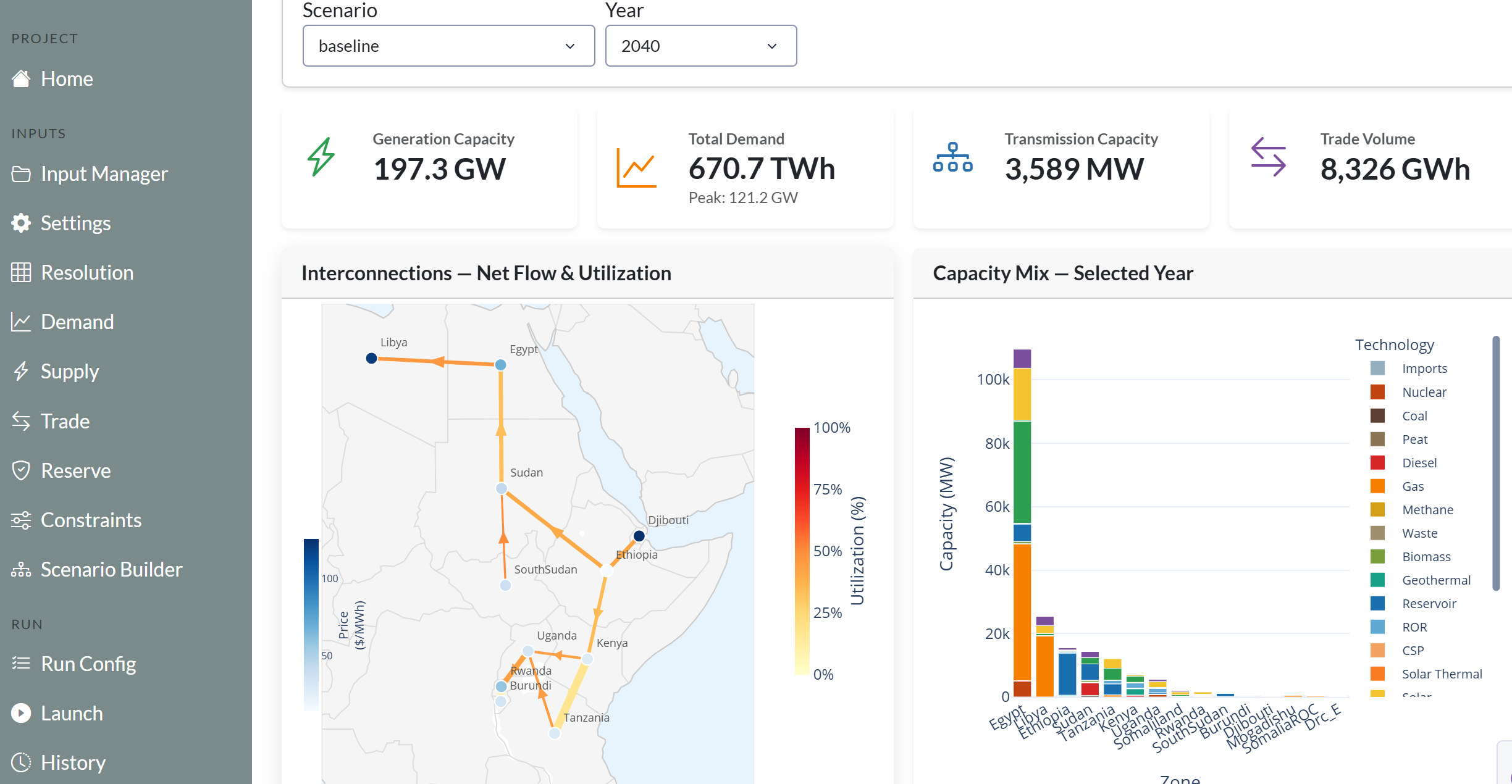 Results overview — capacity, energy, and cost indicators across scenarios.
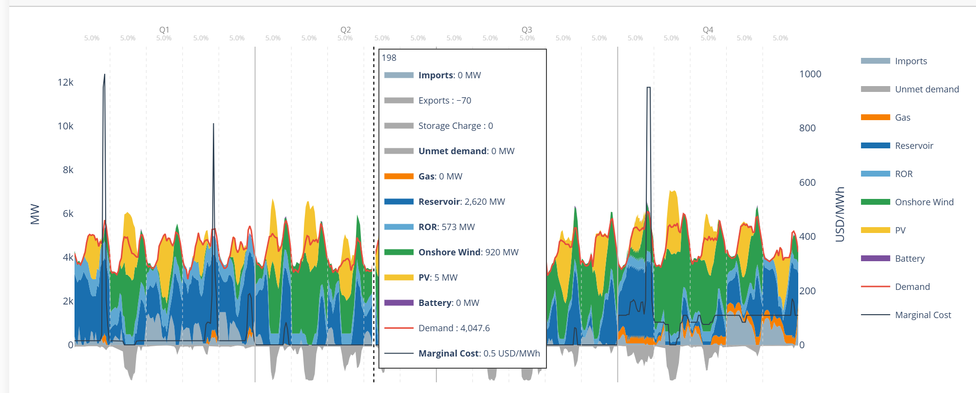 Dispatch view — hourly generation by technology.
The dashboard is in continuous development. Feedback and contributions are welcome.
Python Postprocessing
For users who want full control over analysis and figures. The postprocessing library is at epm/postprocessing/utils.py and is designed to be used from Jupyter notebooks.
Recommended for: custom plots, aggregation across runs, Monte Carlo analysis, publication-quality figures.
Key functions
Data loading
| Function | What it does |
|---|---|
extract_gdx(path) |
Reads epmresults.gdx into a dict of DataFrames |
extract_epm_folder(folder) |
Loads results from multiple scenarios at once |
process_simulation_results(folder) |
Full pipeline: inputs + outputs, ready to plot |
generate_summary(folder) |
Creates summary.csv from all scenario results |
Plotting
| Function | Chart type |
|---|---|
make_stacked_barplot() |
Capacity/energy evolution across years and scenarios |
make_stacked_areaplot() |
Generation dispatch area chart |
dispatch_plot() |
Combined stacked area + demand line |
bar_plot() / line_plot() |
Standard bar and time-series charts |
make_capacity_mix_map() |
Regional map with pie chart overlays |
make_interconnection_map() |
Transmission capacity map |
create_interactive_map() |
Interactive Folium map (HTML) |
Quick start
from postprocessing.utils import process_simulation_results, make_stacked_barplot

results = process_simulation_results("output/simulations_run_20250101_120000")
make_stacked_barplot(results["pCapacityFuel"], title="Capacity Mix Evolution")
Tip
Use extract_epm_folder(..., save_to_csv=True) to convert any GDX-only variable to CSV on demand.
Example notebook
Coming soon
An example Jupyter notebook walking through a full postprocessing workflow will be added here.
Example outputs
 Overview of results across scenarios.
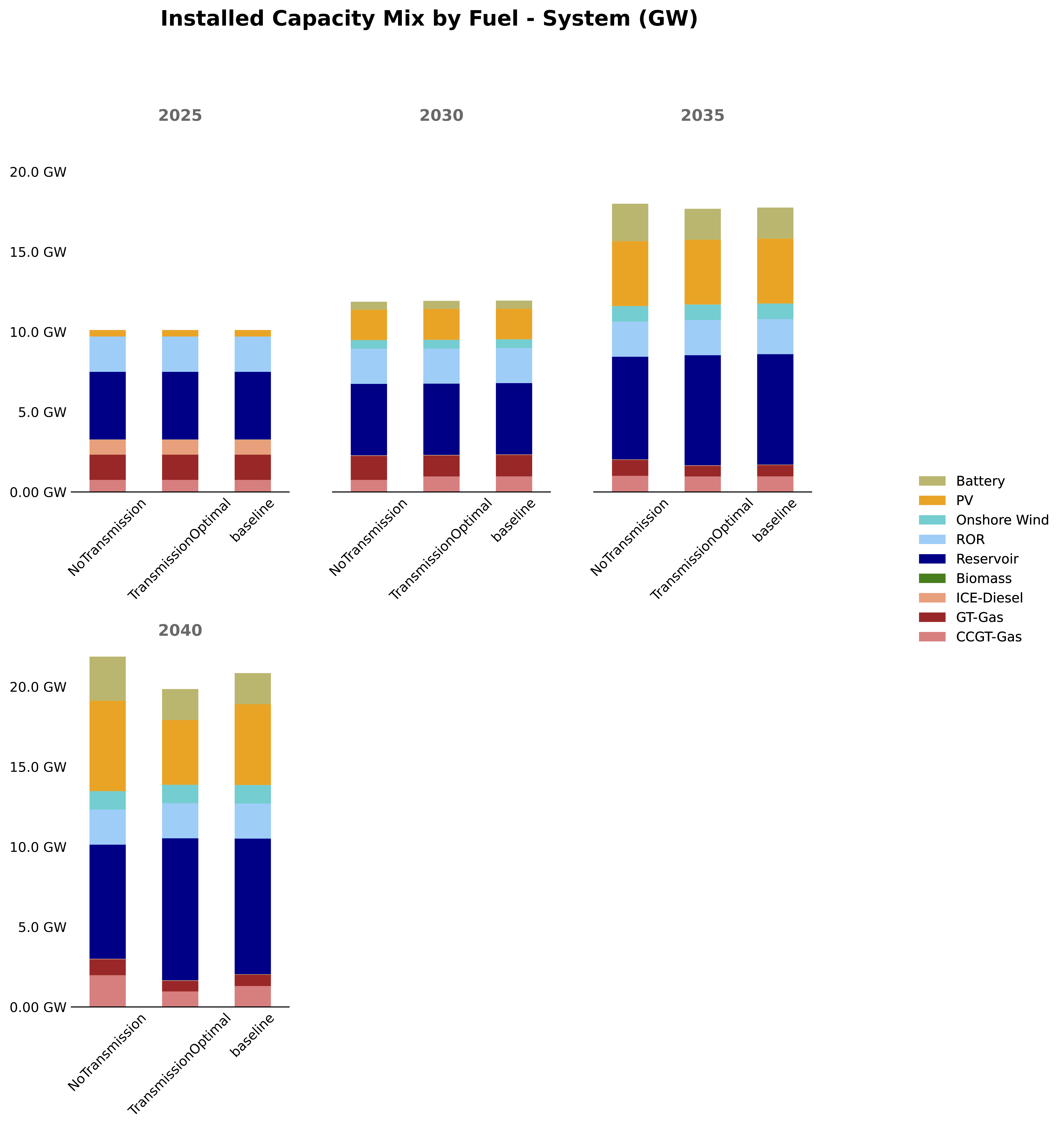
make_stacked_barplot() — capacity mix evolution across scenarios.
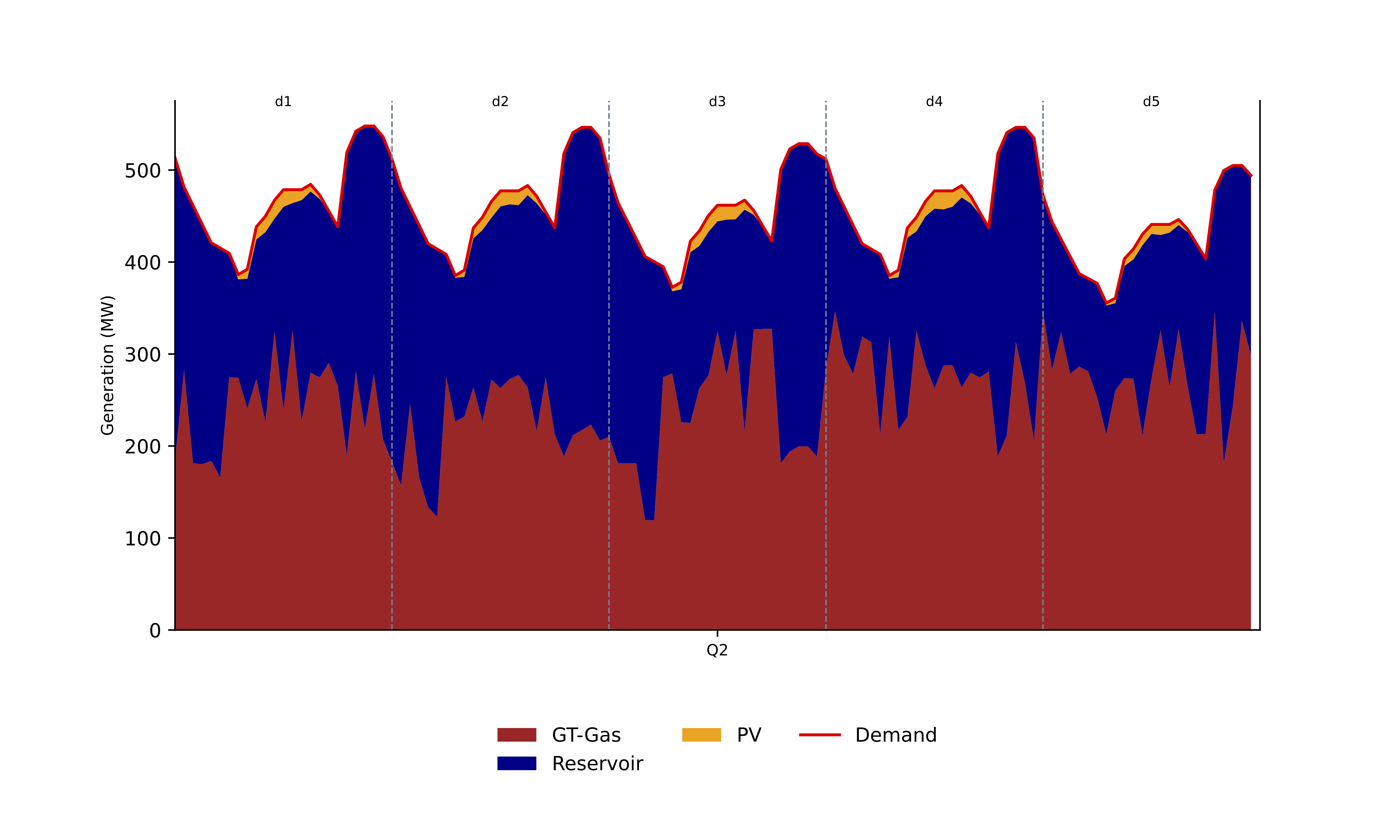
dispatch_plot() — hourly dispatch for representative days.
Tableau
Interactive dashboards using the EPM Tableau template. Best suited for sharing results with stakeholders or comparing multiple scenarios side-by-side.
Example: SAPP Dashboard on Tableau Public
License required
A Tableau Creator license is needed to create or edit dashboards. Contact the energy planning team for access.
Setup
1. Prepare the folder structure
tableau/
├── EPM_Report.twb             # Download template (link below)
├── ESMAP_logo.png
├── linestring_countries.geojson
└── scenarios/
    ├── baseline/              # One scenario must be named "baseline"
    │   └── output_csv/
    │       └── *.csv
    └── scenario_1/
        └── output_csv/
Download the template: EPM_Report.twb
2. Generate the GeoJSON
Update geojson_to_epm.csv with your zone names, then run:
cd epm/postprocessing
python create_geojson.py --folder tableau --geojson geojson_to_epm.csv --zcmap zcmap.csv
This produces linestring_countries.geojson for geographic visualizations.
3. Open in Tableau
Upload the tableau/ folder to OneDrive, connect to the shared VDI (Tableau pre-installed), and open EPM_Report.twb.
4. Extract data
Tableau opens in live mode by default, which is slow. Extract each dataset (Database_Compare, Main_Database, pCostSummaryWeightedAverageCountry, Plant DB, pSummary) via Data → Extract Data → Save settings.
5. Publish
Go to Server → Tableau Public → Save to Tableau Public as to share your dashboard.
Updating for new scenarios
- Replace CSV files in
scenarios/with new run outputs (keepbaselinefolder name). - For each dataset:
Extract → Remove→ then re-extract (Step 4). - Re-publish to Tableau Public.
Tip
If nothing shows up: check the folder structure, verify filters are not hiding data, and confirm extraction completed successfully.